Thursday, December 31, 2009

Year's end post


Final post for this year; I tend to believe one should end the year always on a positive note, much as possible, so here there to lift up your spirits:

I couldn't think of a more positive way to end the year than with a smile, like the one this poster gives me. A bonbon coloured, chick-lit style poster, the Bridet Jones's Diaries for Vampire fans one might say, what's not to like about that?

Love it, love it, love it...


Oh, and by the way:

Have a Happy New Year!

Monday, December 28, 2009

Sex sold


I hear constant complaints about how oversexualized our society has become, how, in these days, it is found everywhere, and used to sell everything ... 'cept for movies, they don't make posters for those the way they used to anymore.


Saturday, December 26, 2009

Still Christmas


...even though you couldn't tell by simply looking outside.
Where's all that snow gone?

Ah, well, think of the somebody you love and show some respect to the others during the festive season.


And remember, no matter how cute they look, live animals do make bad presents!

Friday, December 25, 2009

Deck the halls with boughs of gory


Oh the weather outside is frightful...

It's Christmas and that means we have to give the requisite acknowledging nod to Silent Night, Deadly Night, although I remember that movie as being remarkable only for two things:
It proves that there's nothing to boost a movie's renown like a angry mob.
It stars Linnea Quigley.

There might have been more to it, but I'll be damned if I could remember ... I really should use the festive days to revisit it.
I do like the poster art, which with its plain, somewhat cheesy looking, cardboard feel actually manages to nicely sum up a further quality of the movie: it was shot on a budget.
Back in the 80's that meant no stupid CG effects, oh how I wish we could go back...

Silent Night, Deadly Night has also become such a many used tagline that it long since stopped to be funny, and yet we still find it in as late as 2006 on the German poster for the remake of Black Christmas; I guess we can't really expect much originality from a remake, though, and it beats the silliness of the original tag:
If this picture doesn't make your skin crawl...it's on TOO TIGHT.
Oh my...


Nostalgic Christmas wishes from the Corner.

Thursday, December 24, 2009

Ghosts of Christmas past

Most people I know have some kind of tradition for the festive days, me, I take leisure watching some Christmas faves:


We don't always get what we want so I'm usally stuck with watching the John Wayne version, though I do much prefer the older, darker, black & white version or I just pop in the Japan Animation remake. Also Bogart & Jimmy Stewart, it wouldn't be Christmas without them.


The Corner wishes all his readers, and their friends and family Merry Christmas!

Sunday, December 20, 2009

Family Man


At the very latest since It’s a wonderful life, Hollywood has regularly played with the idea of allowing the lead character to see what would have happened if he hadn’t either taken the road he did or in case of the aforementioned not even existed.

I tend to like that type of movie, and The Family Man promised to be all that. I love Téa Leoni’s part … I love Téa Leoni, period. As an avid Fleetwood Mac listener, I liked the movie title the moment I first heard/saw it.
I also, as unpopular as it may be to admit, liked Nicholas Cage in 8mm.
I do adore that poster, this picture of Nicholas wistfully looking through a store window at the one thing he really wants, a family live.
It’s heartbreaking, it touches on something deep within me.
It shouts Christmas movie at the top of it’s lungs.

Maybe with all that my expectations where set too high to begin with:
As Hollywood convention has it fame and fortune man Nicholas meets an Angel that is willing to fulfil him a wish, and so Nick finds himself gone over night from unhappy, leading a empty life, Bank Broker (or some such) to unhappy, overstressed, family father. Because, you see, our Nick never stopped to wonder what his life could have been had he married his love: Téa Leoni.
And honestly people, who wouldn’t want to wake up married to Téa, even if we ended up with the one from Spanglish?
Our Nick, however, finds out that this Nick is unhappy over never having it made to fame and fortune, and now feels trapped in his marriage. This wouldn’t be Hollywood if he didn’t find out that family life is indeed not one of the minor circles of hell, usually at least, even though he sure begins to think so. But here already the script starts to falter, because married Nick isn’t a pleasant person and beyond being unhappy over the course his life took this Nick is also about to cheat on his wife. So suddenly we should sympathize with a Nick that finds this new life so constraining that he’d rather cheat on sweet, adorable Téa who’s the heart and soul of the family?
Nah, not likely going to happen.
So Nick naturally changes his habits and he does learn something:
He realizes that there’s more needed for a partnership than just love, it takes hard work and dedication, and a willingness to compromise.
Soon as he learned that lesson he finds himself back in his old, empty live.
And here’s the catch, this being a Christmas movie it can’t end thus, so the writer lets Nick meet perchance a older Téa that unhindered by marriage or children made her own way to fame and fortune and we are expected to rejoice for them because now they can become a smug yuppie couple…

My blood was boiling when I saw this long anticipated movie in perfect expectation of a Christmas romance. Instead I got a wooden acting Nicholas Cage that I found to be hardly loveable (even before he wanted to cheat on Téa) in a movie that runs out of actual story about half way through, and to add insult to injury there’s this Hollywood bloke, probably living thousands of miles away, that dares to tell me that I wasted my live on my family, and they theirs on me, and that on Christmas of all days.
I’m actually still furious about this movie.
And yet, I still love that poster beyond reason and would fall for the same trap again if they where to show it now, I just can’t make out for whom they made that movie*? Probably those millions of rich, unmarried yuppies that flock to the cinemas each Christmas?

Given, if you look at the poster it actually shows one of those typical staged Christmas pictures that no one wants to look at anymore after a while, and that should probably tip us off to what Family Man really is about. And if it wasn’t for that forced happy end that lets Nicholas both eat his cake and keep it, telling us others that we are doing something wrong, I could probably live with that.
As usual the Japanese offer a beautiful, more subtle alternative approach. Not as fitting to the typical American style of storytelling, but a perfect picture to illustrate the nature of a loving relationship.


*Apart from easily swayed fools like me, that is.

Thursday, December 17, 2009

Skins


Random, unplanned post. :)

Stumbled over this ad poster while reading up on new books, or rather through a authors interview.
Now, I've never seen that show, but seeing the poster I assumed it was something like Nip/Tuck or other private TV garbage.
Colour me surprised when I read that this is supposed to be for a teen show?
I mean were titles like Playboy's Teen-Mansion or Roman Orgies of the adolescent already sold?

And wow, what kind of ad would they use for a adult oriented show?
Not saying that I don't like that ad, quite the contrary, it find it to be seriously hot, positively erotic, it just surprised me to find out what market the show it promotes is supposed to be for.

Wednesday, December 16, 2009

Art comparison


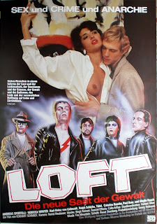
A pretty common image among horror movies, a tad overused actually, but still one that can, when well done, raise interest.


Loft, Germany's answer to the question what the Class of 1984 would have looked like seen through the eyes of John Waters.


Dorian sure smells the Perfume. ;)

Sunday, December 13, 2009

Demonlover


Everytime I read that title I'm instantly reminded of a short story written by Nancy A. Collins which appeared in one of the Hot Blood anthologies.
That has nothing at all to do with the movie and doesn't sway any real influence on my expectations regarding it, or any of the others using Demonlover in their title, I just find it funny how my mind can at times come up with completly unrelated connections and then refuses to let go.
I can almost picture myself watching that movie and go "Well, Nancy A. Collins would have written that scene differently..."

And on a different note: I really dig that poster, it reminds instantly of Rosemary's Baby, and of Dust Devil.
I'm aware that I used to say that last part just a few days ago about a Hellboy poster, but there it was about a similarity in style here I'm talking about a general vibe the poster gives me.
Kinda hard to explain, but I think those that saw Dust Devil will understand what I mean.

Thursday, December 10, 2009

Hellboy


I do not buy DVD’s for their bonus contents, usually. Final Fantasy was close to being a exception to that rule, and Hellboy is pretty close to a DVD set I would say is worth getting for the bonus materials alone*, part of what I liked about them is (small wonder there) the slideshow with advance poster art and different design ideas. It’s something I personally would hope to see become a standard feature like, dunno, putting the original trailer on the DVD. I mean nobody want’s to see a slideshow of movie stills (which isn’t bonus content, it’s just the laziest excuse for having non), but trailers, lobby cards or poster artwork are a part of the movie going experience and therefore they have a place (or should have a place) on every DVD. So much for my rant of the day, on to some artwork for the Hellboy movies:


Let’s start off with these B&W posters for Hellboy II. I don’t recall having seen the version on the left used, which is a pity, while they are bound to put anybody that isn’t familiar with the figure on the wrong track I simply love them. I like that old time spy action feel. I do believe I saw the version on the right at least as online advance; didn’t like them then, don’t like them now, even though they give a fairer sense of the movie’s steampunk scenario, especially the here shown Nemoesque Dr. Krauss.


Advance for the first (left) and the second (right), both following a similar theme, the pairing of our hero from the burning pits with holy symbolism.
Despite the vastly overused imagery I like the first one, but it’s the second one that really works.
First associations: The Godfather, naturally, but it also showcases a darker aspect of the idea behind Hellboy. The comics/movies are set in a universe modelled after H. P. Lovecraft, and there you're either evil or victim, the pictures beautifully reflect Hellboys position between these opposing forces.


A further promotional advance for HB II, playing Toro, doesn’t he look just a tad like Legend’s Darkness in that pose?
And an alternative take on the movie poster, I don’t think it got actually used but I like the playfulness of the approach (they did use the pose for a more dynamic looking version, though).


Two more alt posters for HB II, a new take on the group shot used for the first, I’m partial to the second of them, it reminds me ever so slightly of a cross between the newer Dracula’s gothic style and The Crow.


There’s a lot of different takes of HB in typical hero poses, I love these two for the first and second movie, for one I’m a fan of the wild west movie iconography for other the first reminds me of Dust Devil. The over the top comic design of the second one perfectly captures the mood of the movies.


Not much to say about these two, they are just striking beautiful drawings.
Typical advance art, this is not something you put on a final movie poster, put the kind I could see hanging on my wall.


The final poster version for HB II, typical hero pose, but something feels off in that take, it's to passive a stance; they seem to have wanted to go for a feeling of danger for our heroes, but the way the lower part cuts-off makes it hard realize that they are supposed to be surrounded here. The alternative take found on the DVD, works way better in my opinion, it's a active image with a dynamic to it the other dearly misses.

Btw, what is it with white haired, pale guys anyway?


*In case you wonder: Alien 20th Anniversary Edition, is still my personal reference for a all-round perfect DVD edition.

Monday, December 7, 2009

Marvel Zombies 3

A year ago the third Marvel Zombies series hit the stores with their hommage to some classic horror movies: